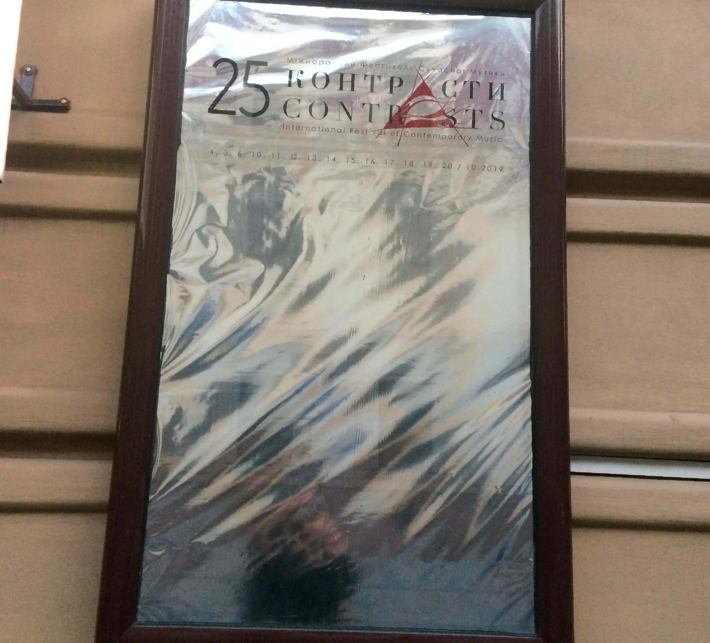
For the 2019 design, we chose the most minimalist design format and returned to the 2016 project, when we worked with external materials and a ready-made approach. Here we turned to foil. The concept was the theme of reflection and playing with material that reflects objects on the street. Thus, the topic of contrast is the difference between the plane of the poster and the outside world reflected in it, here we somewhat went beyond the theme of the basic colors of the festival, since the poster reflected everything that was "seen" on the street. This festival design was iterative and changed several "skins", there was a transition from a photo poster to a poster with foil and finally a poster with a special thermal film.
For thermal film, we printed self-adhesive material, with which we placed the text on the poster.
In the end, the final version of the poster was again printed and realized on the basis of processed foil photos, the dynamic poster design with different angles of the foil was used for individual event posters.